Animated Bubble Chart
- Animated Bubble Chart using Python, Matplotlib, and Image Magick. Matplotlib is used to produce several images, Image Magick to concatenate them as a gif.
📍 Dataset
This example is based on the famous gapminder dataset. It provides the average life expectancy, gdp per capita and population size for more than 100 countries. It is available online here or github repo
Let's load it in python and have a look to the 3 first rows.
## Libraries
import pandas as pd

## read the data (on the web)
data = pd.read_csv('https://raw.githubusercontent.com/nnthanh101/Machine-Learning/main/analytics/data/gapminderData.csv')

## Check the first 3 rows
data.head(3)
| country | year | pop | continent | lifeExp | gdpPercap | |
|---|---|---|---|---|---|---|
| 0 | Afghanistan | 1952 | 8425333.0 | Asia | 28.801 | 779.445314 |
| 1 | Afghanistan | 1957 | 9240934.0 | Asia | 30.332 | 820.853030 |
| 2 | Afghanistan | 1962 | 10267083.0 | Asia | 31.997 | 853.100710 |
💭 Bubble chart
Let's build a bubble chart for the first year of the dataset (1952). Let's build one using the scatter() function of matplotlib:
# import matplotlib
import matplotlib.pyplot as plt

# And I need to transform my categorical column (continent) in a numerical value group1->1, group2->2...
data['continent']=pd.Categorical(data['continent'])

# Set the figure size
plt.figure(figsize=(10, 10))

# Subset of the data for year 1952
data1952 = data[ data.year == 1952 ]

# Scatterplot
plt.scatter(
    x = data1952['lifeExp'],
    y = data1952['gdpPercap'],
    s=data1952['pop']/50000,
    c=data1952['continent'].cat.codes,
    cmap="Accent",
    alpha=0.6,
    edgecolors="white",
    linewidth=2);

# Add titles (main and on axis)
plt.yscale('log')
plt.xlabel("Life Expectancy")
plt.ylabel("GDP per Capita")
plt.title("Year 1952")
plt.ylim(1,50000)
plt.xlim(30, 75);
🎥 Animation
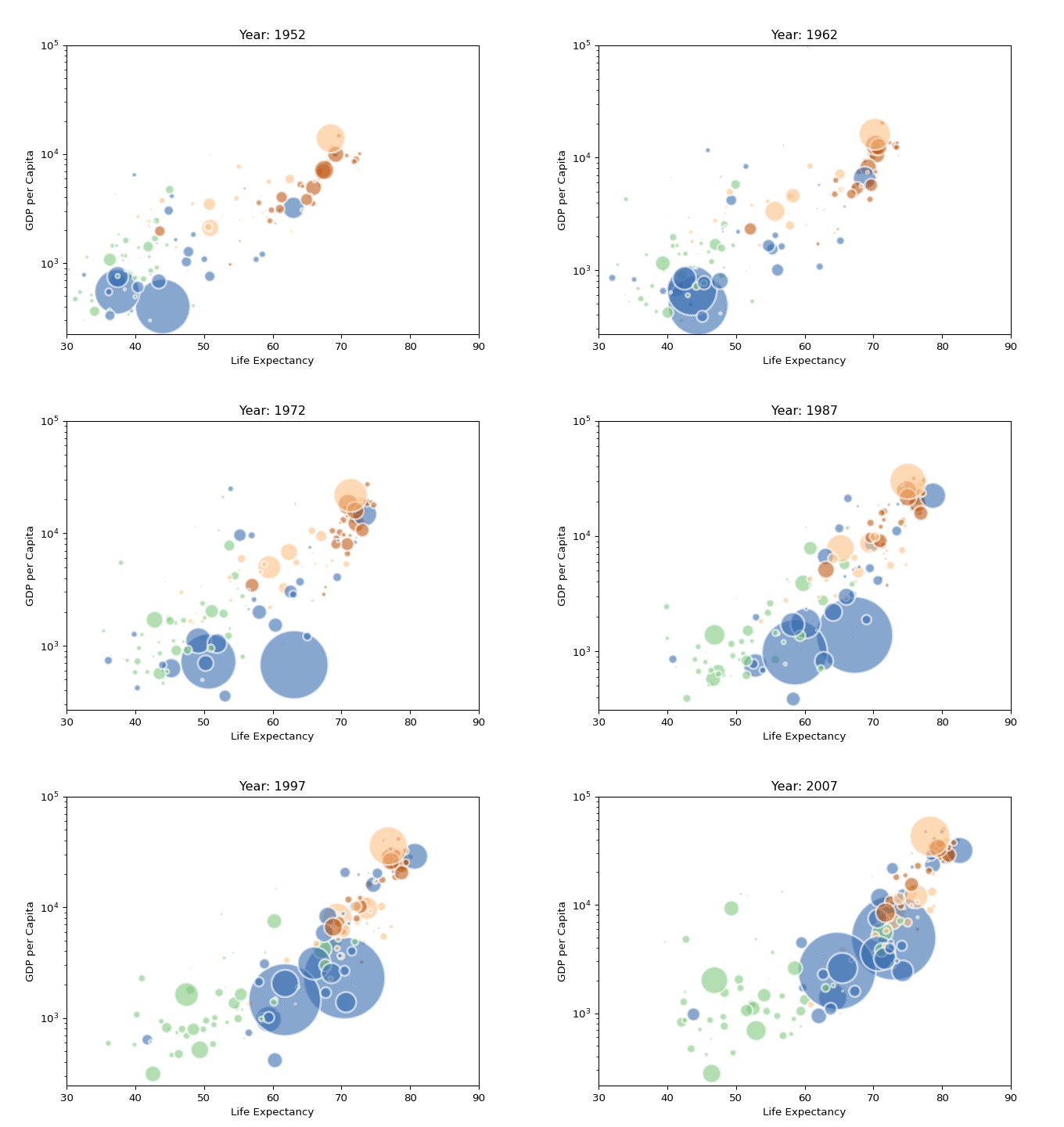
An animation is basically a set of static images visualized one after the other. The strategy here is to build on png file for each year of the dataset, and then concatenated them as a gif.
Let's build a loop that will output one png file per year of the dataset:
# image resolution
dpi=96

# For each year:
for i in data.year.unique():

    # Turn interactive plotting off
    plt.ioff()

    # initialize a figure
    fig = plt.figure(figsize=(680/dpi, 480/dpi), dpi=dpi)

    # Find the subset of the dataset for the current year
    subsetData = data[ data.year == i ]

    # Build the scatterplot
    plt.scatter(
        x=subsetData['lifeExp'],
        y=subsetData['gdpPercap'],
        s=subsetData['pop']/200000 ,
        c=subsetData['continent'].cat.codes,
        cmap="Accent", alpha=0.6, edgecolors="white", linewidth=2)

    # Add titles (main and on axis)
    plt.yscale('log')
    plt.xlabel("Life Expectancy")
    plt.ylabel("GDP per Capita")
    plt.title("Year: "+str(i) )
    plt.ylim(1, 100000)
    plt.xlim(30, 90)

    # Save it & close the figure
    filename='animated-bubble-chart/Gapminder_step'+str(i)+'.png'
    plt.savefig(fname=filename, dpi=96)
    plt.gca()
    plt.close(fig)
Now, you should have a set of 12 images in the
animated-bubble-chartfolder. Image magick is a command line tool that allows to concatenate those images in agiffile.
- Install ImageMagick with this line of bash:
brew install imagemagick
Once the tool is installed, you can concatenate the 12 images using the following command:
## Invoke imagemagick to terminal (Bash)
# convert -delay 80 Gapminder*.png animated_gapminder.gif
Note: the above line of code is written in
bash, not inpython. You have to execute it in a terminal, not in your python environment.
And here is the final result
